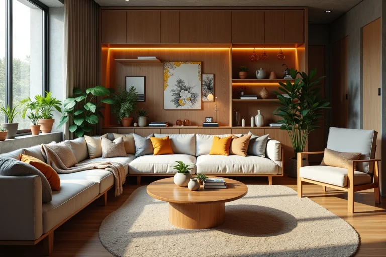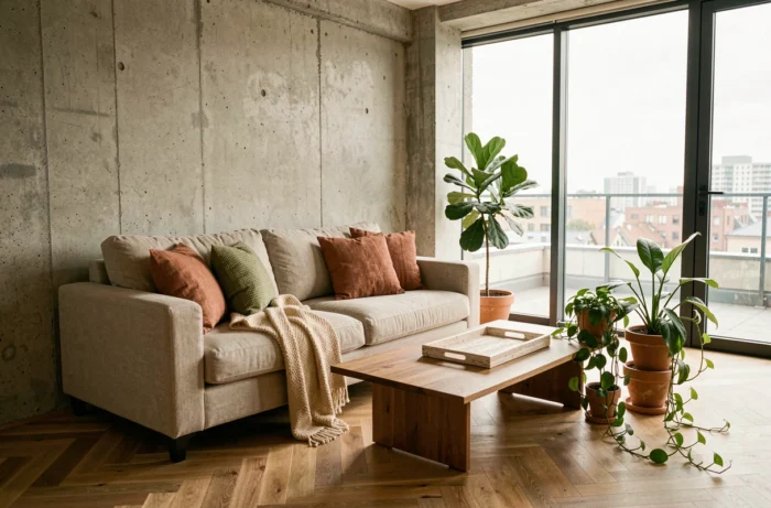
Get Inspired by the Latest Decor Trends to Transform Your Home into a Unique Space
Regionally tailored color palettes, the diagnosis of material reuse, and adaptable layouts are redefining interior decoration well beyond fleeting trends. We are witnessing a structural shift: the decor trend is no longer just about a choice of color or style; it involves technical decisions regarding the durability, modularity, and traceability of interior components.
Adaptive Design: Designing a Space for Multiple Life Cycles
A living room designed for a fixed configuration becomes obsolete as soon as the use changes. Adaptive design is based on a simple principle: every piece of furniture and every partition must be able to move, fold, or change function without heavy intervention.
We recommend prioritizing lockable wheeled furniture, reversible sliding partitions, and retractable work surfaces. These devices allow an office to transform into a guest room, or a dining area to free up play space for children in just a few minutes.
This modular approach contrasts with the fixed decoration still found in the majority of interiors. It requires thinking of the layout as a system, not as a photographable scene. Furniture becomes interchangeable components, not permanent decorative pieces.
What distinguishes a truly adaptable interior from a simply “tidy” space is the quality of the fastenings and rails. A poorly sized partition rail renders the entire system unusable in less than two years. Anodized aluminum pocket systems offer significantly greater longevity than PVC versions.
To delve deeper into these interior design topics, the home articles on Atypique Info regularly discuss the technical choices that determine the durability of a decor project.
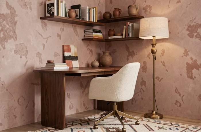
Material Reuse and Traceability: The Regulatory Angle Ignored by Decor
Reuse is no longer just an aesthetic “vintage” stance. It falls within a framework of material traceability linked to the PEMD diagnosis (Products, Equipment, Materials, and Waste). This diagnosis requires identifying the assemblies of a building and assessing their reuse potential before any significant demolition or renovation.
In decoration, this translates concretely into a question that few decorators ask: where does this material come from, and what will happen to it at the end of its usage cycle in this interior? A solid wood floor reclaimed from a rehabilitation site does not hold the same value as new laminate, nor the same future.
Selection Criteria for Reused Materials in Interior Decor
- The condition of the assemblies: an old cement tile with intact original mortar can be reused without additional underlayment, while a detached tile requires complete leveling
- Dimensional compatibility: old formats (20 x 20 tiles, 70 mm wide parquet planks) do not fit into standardized frameworks without compensatory cuts
- Documented provenance: a traceable lot from an identified site guarantees the absence of pollutants (lead in old paints, asbestos in some adhesives pre-1997)
A non-traced reused material may contain regulated substances that negate any environmental and health benefits. We find that this verification is often absent from most so-called “eco-responsible” decor projects.
Regionally Tailored Color Palettes: Adapting the Color Chart to the Built Context
The choice of a wall color should never stem from a generic color chart. Palettes tend to regionalize: terracotta, eggplant, and tobacco brown tones in areas marked by limestone or ochre plasters, versus off-whites and faded blues in northern or coastal contexts.
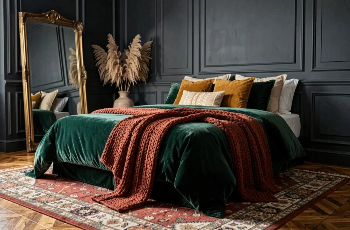
This regionalization is not a whim. It is based on a verifiable optical principle: a wall color interacts with the natural light filtered by the external environment. A terracotta works in the South because the ambient light is warm and direct. The same terracotta in a north-facing Breton interior produces a dull and closed effect.
We recommend testing paint samples on at least three walls of different orientations for a full week before finalizing a choice. Brands now offer repositionable A4-sized samples that simplify this step without incurring costs.
Patterns and Textures: Handmade Ceramics vs. Standardization
Handmade ceramics are gaining ground against uniform industrial tiles. Surface irregularities, variations in shade from one tile to another, and slight differences in thickness create a visual depth impossible to reproduce in series.
Technically, these irregularities require a more demanding installation. A tiler used to rectified formats will need to adjust their adhesive (systematic double gluing) and plan for wider joints (between 3 and 5 mm compared to 2 mm for rectified). The installation cost increases significantly compared to industrial tiling, but the durability of handmade glazed ceramics far exceeds that of printed stoneware.
Objects and Plants: Balancing Decorative Accumulation and Space Breathing
The trend of accumulating decorative objects, indoor plants, and wall art on every available surface produces an outcome opposite to that desired. An overloaded space tells no story; it suffocates.
The principle we apply: every displayed object must justify its place by a function (light, storage, acoustics) or by a documentable personal story. A vase bought in a set of three “just to fill the shelf” is a symptom, not a decoration.
- Limit plants to species suited to the actual light of the room, not to the desired Pinterest effect: a Monstera in a north-facing room without additional lighting will yellow in a few months
- Group decorative objects in threes at most on the same visual plane, varying heights and materials
- Leave at least one third of each horizontal surface (shelf, console, worktop) completely empty
The most accomplished interior decoration is often the one that knows how to remove rather than add. A bare wall next to a strong piece of furniture creates a contrast that ten overlapping frames will never achieve.